Bright Simple: A Bold Display Font for Web Design
I had just dropped a new hero image into a Figma file for a boutique home decor client. The photo was warm, textured, and full of personality—but the headline sat flat. It felt like a placeholder, not a statement. I scrolled through a few typeface options, and the moment I applied Bright Simple to that large title, the layout clicked. It wasn’t just a font change; it was the voice the design had been missing.
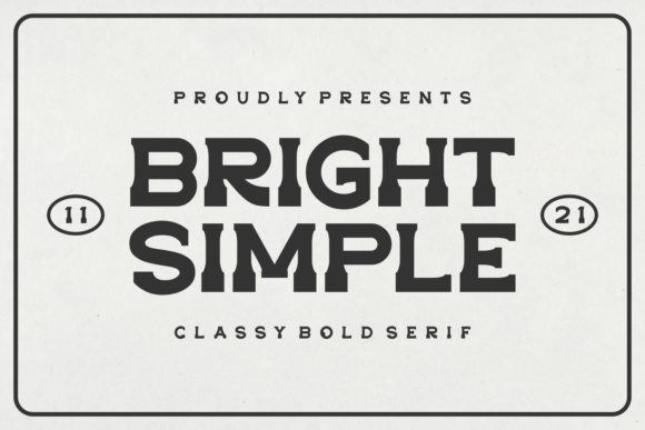
Bright Simple is a cool, confident display typeface that brings instant character to a screen. It’s bold without being aggressive, modern without feeling cold, and playful enough to feel approachable. The letterforms have a clean, slightly condensed structure with a rounded, friendly finish that makes it feel right at home on creative websites, editorial layouts, and brand-forward landing pages. As a web designer, I’m always looking for typefaces that can carry a strong visual message while leaving room for the rest of the design to breathe—and this one does exactly that.
Testing Bright Simple in a Real Web Layout
I wanted to see how Bright Simple performed beyond the typical type tester. I built a quick landing page concept for a sustainable fashion brand: a full-width hero with a large headline, an overlay on a lifestyle photo, and a few section headings throughout the page. The font’s personality immediately shifted the tone. The words felt curated, as if they belonged to a brand that cared deeply about design.
In the hero section, set at around 72px on desktop, the font had a magnetic pull. The slightly rounded terminals and open counters kept it legible even when placed over a busy image with a semi-transparent overlay. The bold weight held its own against the background, and the visual hierarchy was clear without needing a drop shadow or heavy outline. For a creative portfolio or a boutique online store, Bright Simple can become the defining element of the above-the-fold experience.
I also tested it on a coaching website concept—a much cleaner layout with a white background and minimal imagery. Here, the font’s friendly boldness felt warm and encouraging, ideal for a tagline like “You’re ready for what’s next.” It didn’t scream or shout; it just sat confidently at the top of the page, inviting the visitor to scroll. That kind of balance between presence and subtlety is rare in a display font.
Where Bright Simple Shines in Digital Design
This isn’t a workhorse typeface meant for long-form reading. It’s a star performer in specific, high-impact areas. After testing, I’d confidently reach for Bright Simple in these digital contexts:
- Hero titles and page headers – The natural home for this font. It grabs attention without overwhelming the message.
- Landing page call-to-action sections – Short, punchy phrases benefit from the bold weight and clean silhouette.
- Blog post featured images and social graphics – When overlaid on photos, the type stays readable and adds a designer touch.
- Online shop banners and promotional headers – Especially for creative, lifestyle, or handmade brands that want a modern but human feel.
- Logo text and wordmarks – The font’s distinctive character can serve as a simple, text-based logo for service-based businesses or digital products.
- Course sales pages and digital product previews – It gives a polished, premium look to highlight modules, bonuses, or key selling points.
In a recent redesign for a digital brand kit, I used Bright Simple for the section titles and a clean sans serif font for the body copy. The combination felt intentional and fresh. The display font anchored the page, while the secondary typeface kept the longer descriptions readable. That pairing is a design pattern worth repeating: let Bright Simple do the heavy lifting for headlines, and pair it with a neutral workhorse like Inter, DM Sans, or even a light-weight serif for contrast.
Readability and Responsive Considerations
Every web designer knows that a beautiful typeface on a large desktop canvas doesn’t always translate to a small mobile screen. I previewed the test layout on a phone-sized viewport, and the font scaled well. At 32–40px for section headings, it remained crisp and legible. The letter spacing felt natural, and I didn’t need to add extra tracking. However, I’d recommend increasing the line-height slightly on mobile to avoid a cramped feeling, especially if the heading wraps to two lines.
On dark backgrounds, Bright Simple holds up beautifully. The rounded shapes prevent the text from feeling harsh, which is a common issue with some bold display fonts. On light backgrounds, it’s equally effective, though I’d be cautious with extremely thin font weights in the same family if they exist—the contrast between thick and thin strokes could become a legibility issue on low-resolution screens. For buttons, the font works well for larger, hero-style CTAs like “Shop the Collection” or “Start Your Journey,” but I’d avoid using it for small, text-heavy buttons or navigation links. That’s where a simpler sans serif takes over.
For image overlays, I found that a subtle background gradient or a slight text shadow (just a few pixels of blur) helped the font pop without looking dated. The letterforms are strong enough to stand on their own, but a little breathing room against a complex photo goes a long way.
When to Choose a Different Typeface
No single font can do everything, and Bright Simple is no exception. In my testing, there were a few places where it didn’t feel like the right choice. Long paragraphs of body text became tiring to read after a few lines. The bold weight and display-oriented design overwhelm the eye when set at small sizes for extended reading. I’d also steer clear of using it for form labels, tooltips, dense data tables, or any interface element that relies on quick, precise scanning. Accessibility is a priority, and in those cases, a highly readable sans serif font or a standard system font is the safer path.
If you’re designing a large-scale e-commerce site with hundreds of product cards, Bright Simple could work as a category header, but the individual product names would benefit from something more neutral. Similarly, for a news site or a blog with heavy reading, the font is best reserved for feature titles and pulled quotes, not the article body. Knowing these boundaries helps you use the font with intention, not frustration.
Font Pairing and Brand Identity
One of the most enjoyable parts of working with Bright Simple is finding a complementary typeface. For a modern, clean look, I paired it with a geometric sans serif font like Work Sans. The contrast between the playful display and the minimal body text elevated the design without adding visual clutter. For a more editorial, refined feel, a light serif font like Cormorant Garamond created a beautiful tension—the bold, friendly title against an elegant, classic body. This pairing felt especially suited to a lifestyle blog or a high-end stationery brand.
If you’re building a brand identity from scratch, Bright Simple can serve as the primary display typeface across all digital touchpoints. Use it consistently on your website headers, social media templates, and digital ads. The repetition builds recognition, and the font’s distinctive personality helps audiences remember the brand. Just be sure to check the commercial font licensing before embedding it across a client’s site or using it in a template you plan to sell. Most reputable font foundries offer clear webfont licenses, but you’ll want to confirm the allowed page views, domains, and formats like WOFF2.
Working with the Font Files and Technical Details
Before committing to any font for a web project, I always dig into the file formats and character set. With Bright Simple, I’d recommend checking if the family includes multiple weights, any alternates or ligatures, and support for multilingual characters. Even if a project doesn’t need them today, it’s wise to future-proof. For a global brand or a multilingual site, you’ll need extended Latin, and perhaps Cyrillic or other scripts, so verify that the font covers your needs.
If you’re using the font in a design tool like Figma or Adobe XD for mockups, the desktop version likely works as a standard OTF or TTF. For web use, you’ll need a webfont kit. Self-hosting the font files gives you control over loading performance, but you can also use services like Adobe Fonts or Fontshare if the license allows. Always test the font’s rendering on actual devices—what looks crisp on a Mac might appear slightly heavier on a Windows machine due to different font smoothing. This is normal for many display fonts, and a quick cross-browser check will reveal if any adjustments are needed.
I also enjoy exploring the more subtle details. Does Bright Simple include any stylistic alternates that could add flair to a specific word? Are there swashes or ligatures that could make a logo mark feel custom? Those small touches can elevate a creative font from a simple tool to a core design asset. In my test, the font had a clean, no-fuss character set with a few pleasant surprises in the letter combinations, which kept the type feeling handmade and human.
There’s a quiet confidence in Bright Simple. It doesn’t try to be everything to every design, and that’s exactly why it works. It’s a bold, intentional choice for headlines, hero sections, and brand moments that need to feel authentic and crafted. When I finished the mockup for that boutique client, the headline finally felt like it belonged. The type was no longer just a layer in the design—it was the voice of the project. And that’s the kind of asset you want to keep in your fonts library.